NoirShade is a Chrome extension that enables dark mode across websites with smooth UI transitions, site-specific CSS compatibility, with a 100% ad-free experience.
This case study highlights the user-centered design process and UI/UX decisions made to ensure usability, clarity, and consistency.
MY ROLE
UX Researcher
UI Designer
Interaction Designer
Visual Brand Designer
PROBLEM STATEMENT
Most dark mode extensions are either:
Too heavy on performance
Visually inconsistent
Poorly designed with outdated UIs
Distracting due to ads or bloat
Users want a distraction-free, visually appealing, and site-compatible dark mode experience that respects design clarity.
GOAL
Design a modern, fast, and user-friendly dark mode extension that:
Works across any site with minimal bugs
Offers intuitive toggling
Has smooth visual transitions
Provides an aesthetic, minimal UI
Supports site-specific overrides when needed
TARGET USERS
Web users who browse at night or in low light
Developers or designers who prefer a darker interface
Students and researchers spending long screen hours
People with visual comfort issues (light sensitivity)
USER RESEARCH (Lite)
Informal interviews were conducted with:
4 dark mode extension users
2 developers using code-specific dark themes
1 visually sensitive user (Deuteranopia)
INSIGHTS GATHERED:
Users hate bloat — they want minimal UI
Consistency is key — white flashes are annoying
Control is a must — ON/OFF toggle is non-negotiable
Trust matters — no ads, no popups, no data collection
One of the participants had red-green color blindness (Deuteranopia), which informed decisions about maintaining high contrast and avoiding red/green UI indicators
DESIGN PRINCIPLES FOLLOWED
Minimalism – Fewer distractions, focus on function
Clarity – Simple ON/OFF states with immediate feedback
Performance-Oriented Visuals – No unnecessary animations or delays
Consistency – Neutral, readable UI that blends well
WIRE-FRAMES (Lo-Fi)
Wireframe 1: Basic Dashboard
Wireframe 2: UI Components + Social Cards
Wireframe 3: Other UI Components + Alignments
UI DESIGN DECISIONS (Hi-Fi)
Main Toggle Interface:
Large toggle button
ON/OFF status clearly labeled
Smooth animation transition
Optional minimal shadow for visual separation
OPTIONS PANELS:
About the extension
Social links
Chrome Web Store rating button
Upgrade CTA for future roadmap
No login or account needed
COLOR PALETTE:
Dark gray background (#1e1e1e)
Soft white text (#f1f1f1)
Accent: Blue or Cyan (#0bd0ff – customizable in future)
TYPOGRAPHY:
Clean Montserrat font
Slightly rounded corners for UI friendliness
ACCESSIBILITY
High contrast text and background
Large toggle button for easy access
Visual feedback on interaction
Minimal animations for motion-sensitive users
BRAND IDENTITY
Name Meaning:
Noir (French for Black) + Shade = NoirShade
Tone:
Elegant • Professional • Developer-friendly • Lightweight
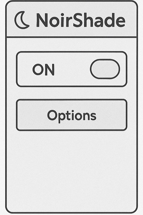 Wireframe 1: Basic Dashboard
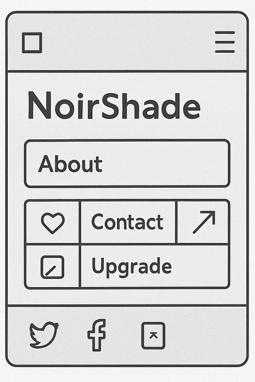 Wireframe 2:
 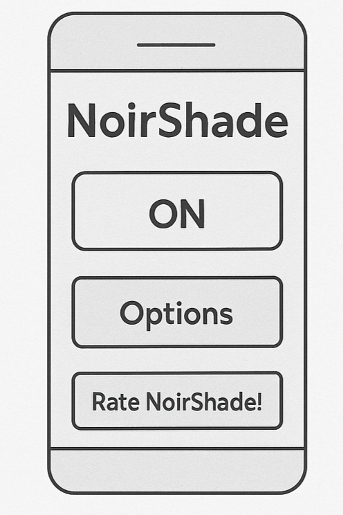 Wireframe 3:
.png)
.png)